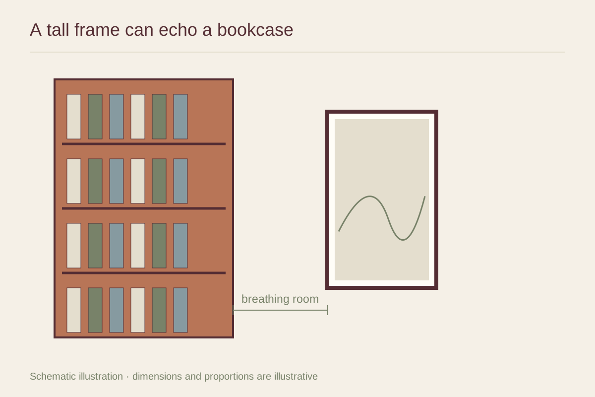
Compare the two vertical shapes
Measure the clear wall between the bookcase and the next boundary. Include door trim, curtains, and the space needed to use the shelves. A narrow print may fit physically but still feel cramped if its frame nearly touches the bookcase.
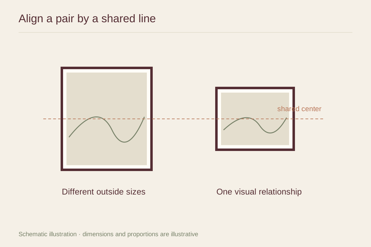
Try a paper outline at several heights. Aligning the frame top with the bookcase can create a strong architectural line, but it may place the image too high. A lower position related to a nearby chair can be more comfortable. Choose the relationship that serves the room's main view.
Offer a different pace
Books create many small vertical and horizontal marks. A print with broad shapes, open paper, or a simple subject can provide contrast. A detailed print can also work if the shelves are visually quiet, but inspect the full scene rather than choosing the art in isolation.
A frame that repeats the bookcase material can connect the objects. A different finish can separate them more clearly. Avoid an almost match that looks accidental; test real samples when two wood tones will sit very close together.
Keep access and light clear
Check that opening cabinet doors or reaching for books will not strike the frame. If the bookcase can move, follow its anchoring instructions independently of the artwork installation. The art should not be used to conceal a missing safety fixing or a maintenance problem.
Look for shadows cast by the bookcase and reflections from nearby lamps. A pale drawing may disappear in a dark strip of wall, while a high-contrast image remains legible. If the chosen print needs better light than that location provides, use the wall for a different work rather than forcing the pairing.