Choose the amount of repetition
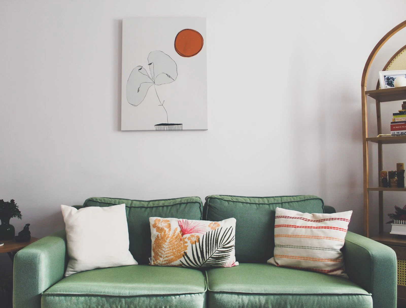
A small patch of the sofa's color in a print may be enough to connect the two. The rest of the image can explore other tones or remain neutral. If both sofa and artwork contain large fields of the same saturated color, the effect will be stronger and more enveloping.
Use a fabric swatch when comparing real prints or mat samples. Photographs of upholstery can shift with light and camera settings. Do not reject a work because the hues are not exact; related colors often make a more interesting pair than a precise match.
Compare visual weight
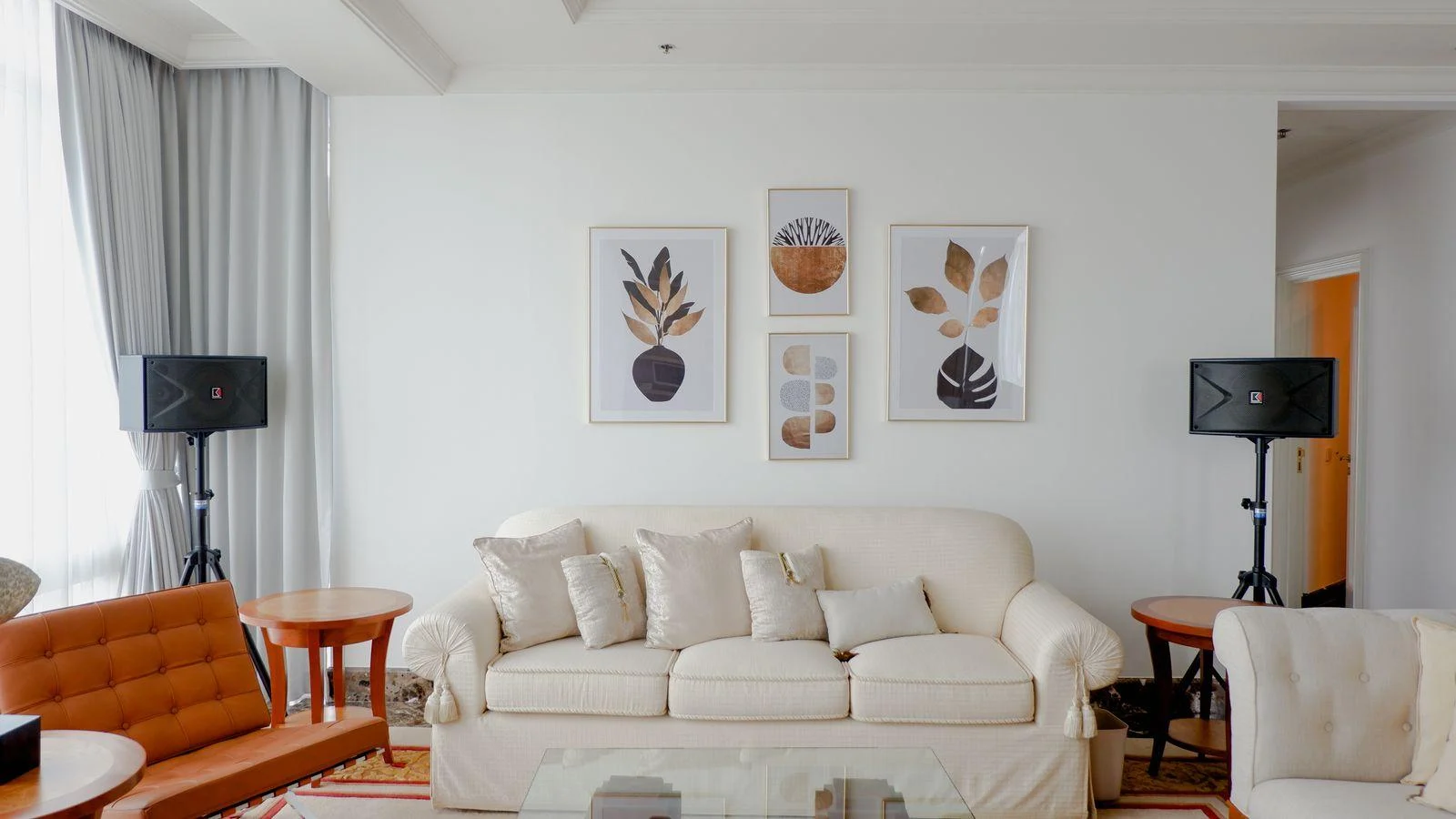
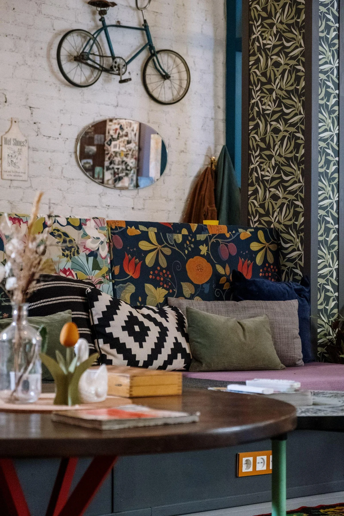
A vivid sofa with a simple shape can coexist with detailed art. A patterned sofa, ornate legs, and many cushions may call for a quieter picture or a single larger image. Look at the amount of activity in the full seating area, not just the sofa color.
The frame can mediate between the furniture and the wall. A pale mat creates a pause, while a dark frame may connect the art with a table or lamp. Avoid adding a brightly colored frame automatically; the picture may already supply all the connection needed.
Try contrast without overcommitting
Use a paper outline and a small reproduction to compare one contrasting option with one tonal option. A green sofa might sit comfortably below a warm landscape, a monochrome photograph, or a pale abstract. The useful choice depends on the image's character and your preferred mood, not a fixed color formula.
View the combination with the cushions and throws you actually use. If you have to remove every ordinary object to make the art work, the pairing may be too fragile for the room. A successful choice leaves room for daily life and still gives the image a clear place above the sofa.
Test a room with one strong sofa
For a deep blue sofa, compare a print with a small blue detail against one with warm ocher and cream. The first can make a gentle connection; the second can provide contrast. Keep the frame size and surrounding cushions constant while deciding which relationship you prefer.
Then bring back the normal throws and side-table objects. If the warm print introduces too many new colors, a simpler image may work better than buying more accessories to explain it. If the blue echo feels overly matched, reduce the amount of repeated blue rather than discarding the whole idea.