Choose the view that matters most
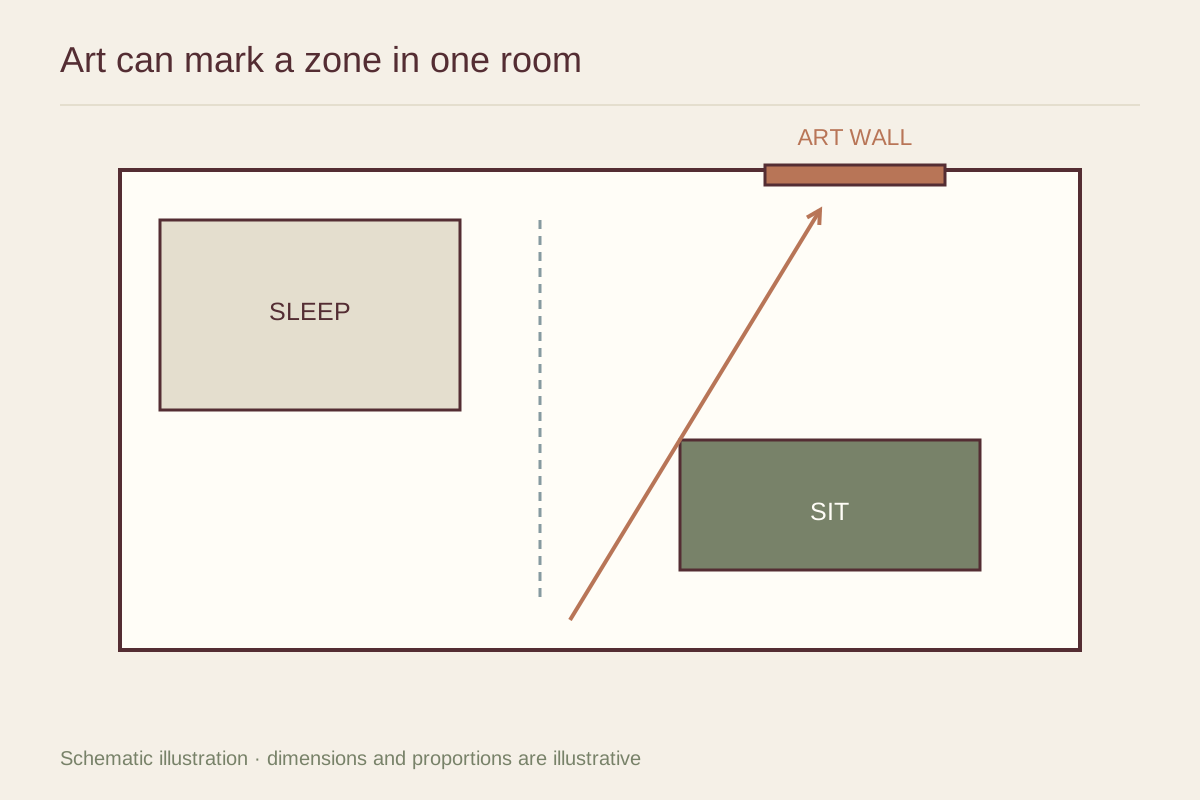
Stand at the entrance and note which wall is seen first. Then sit at the desk, dining spot, and sofa or bed. A picture may be visible from several zones, so its position should make sense in more than one view. Do not select a layout only for the entrance photograph.
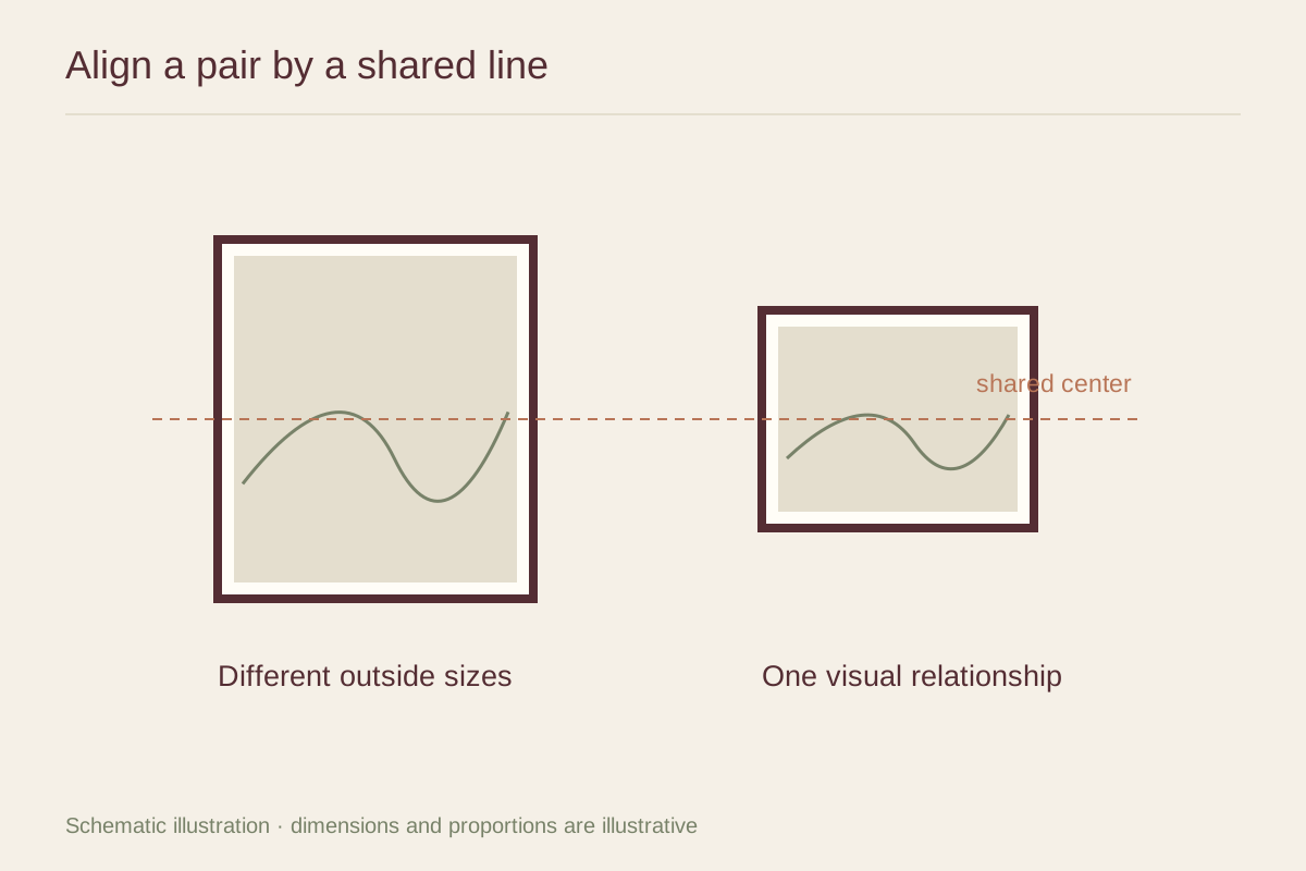
One larger work can anchor the main living area, while a smaller piece can accompany the desk. The two do not need equal prominence. A hierarchy helps the room feel organized without requiring every activity zone to have its own gallery wall.
Connect through a limited vocabulary
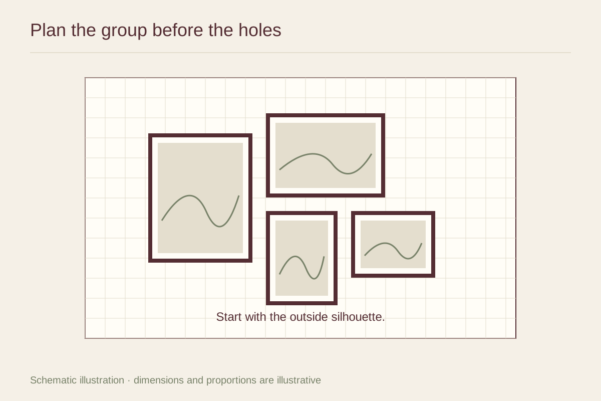
Repeat one quality across the art: a frame finish, paper tone, or modest color connection. Keep the subjects varied if that is what you enjoy. Matching every image too closely can make the apartment feel like a furnished display rather than a place assembled around real preferences.
Include storage and textiles in the comparison. A bookcase, patterned bedding, and kitchen shelves may already contribute substantial detail. A few pictures with open space can offer relief, while a vivid work can give a pale room a stronger center.
Use small walls deliberately
A narrow strip beside a desk or doorway can hold a small work that rewards close looking. Do not assume every available strip needs art. Some walls are useful for movement, light switches, or the visual breathing room between zones.
Avoid placing frames where folding furniture, cabinet doors, or a sleeper sofa will strike them. Test the apartment in its different modes, including when the bed is made and the table is extended. A display must work during the transformations that make a small home usable.
Think ahead to moving
Choose frames you can carry and reuse in another layout. Keep measurements and packaging where possible, and check rental hanging rules before installation. A compact collection of works you enjoy can adapt to a future apartment more easily than a wall filled solely to fit the current furniture plan.