Observe a normal day
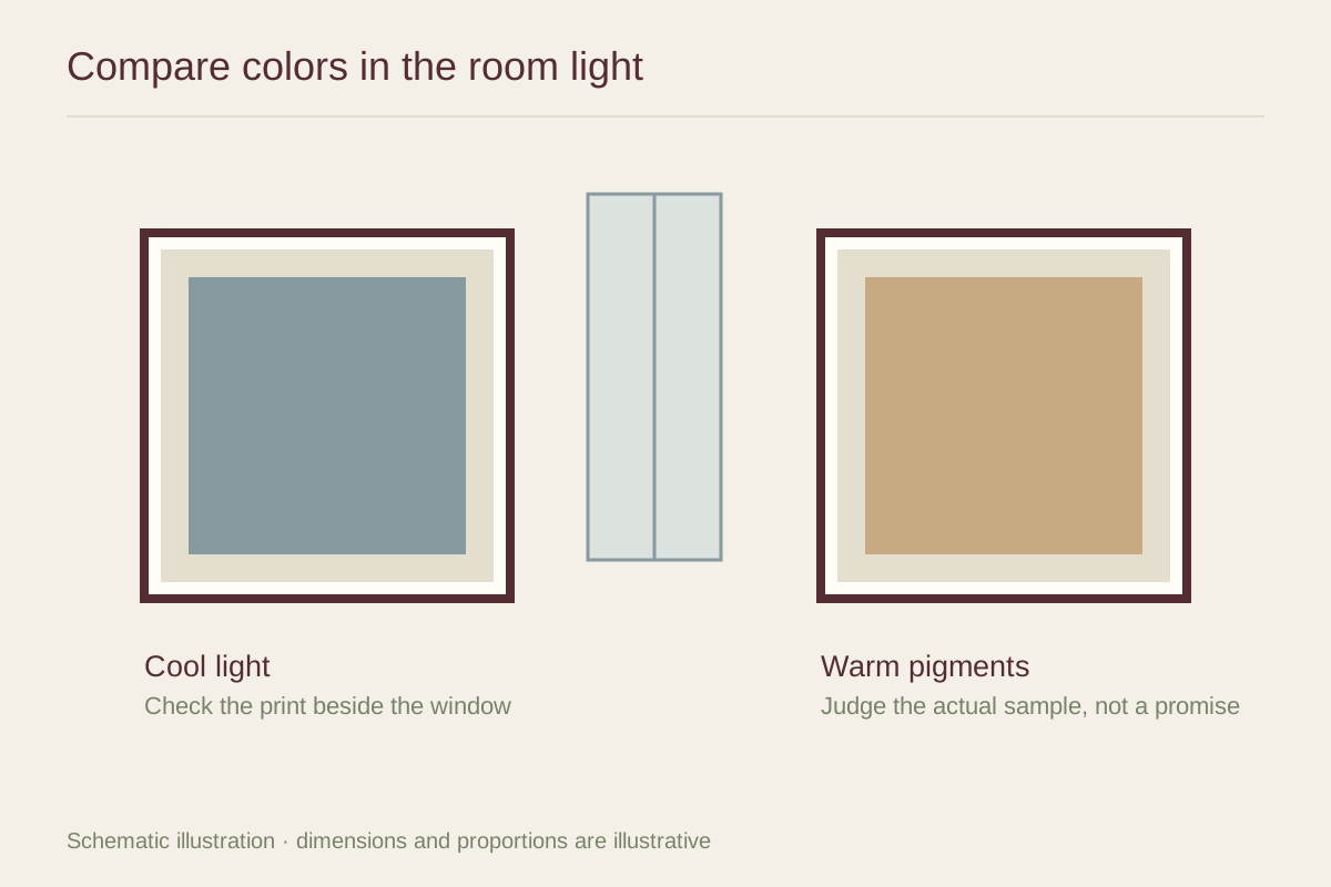
Look at the proposed wall in the morning, afternoon, and evening. Note when the room feels dim and which lamps are normally used. A paper sample held near the window may look much brighter than the same sample on a wall farther inside.
If you are comparing prints online, resist raising the screen brightness until every image looks luminous. A reflective paper print cannot emit light. Ask for paper samples or view the work in person when the distinction between subtle pale tones is central to your choice.
Choose contrast as well as color
A warm palette can feel welcoming, but a muddy low-contrast image may still disappear in dim light. A cooler print with clear light and dark areas may remain easier to read. Consider the structure of the image, not just whether it contains yellow, orange, or blue.
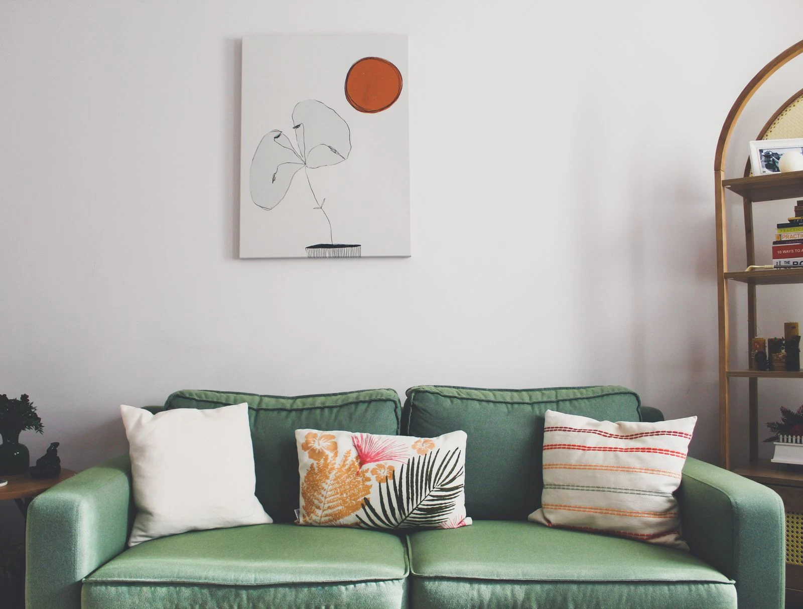
Pale paper and a light mat can give an image a distinct outline against a darker wall. Conversely, a dark frame can help a pale drawing remain defined on white paint. Try both approaches with samples before deciding the room needs a different wall color.
Let lighting support the picture
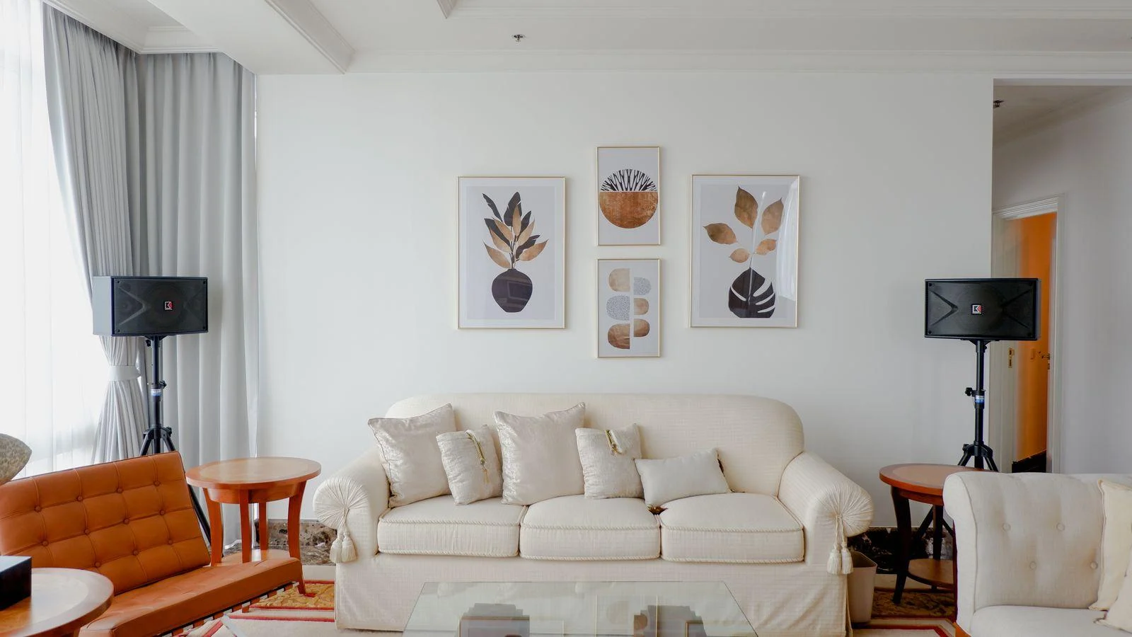
Test the artwork under the lamps already in the room. Different bulbs can change the apparent relationship between wall, mat, and ink. If you change a bulb, evaluate the rest of the room too; an art display should not make the reading chair or work area less comfortable.
Avoid placing a vulnerable print in direct sun simply to make it appear brighter. North-facing does not guarantee that no sun ever reaches the wall. Watch for seasonal light paths and reflected glare, and choose a display location that remains useful across the year.