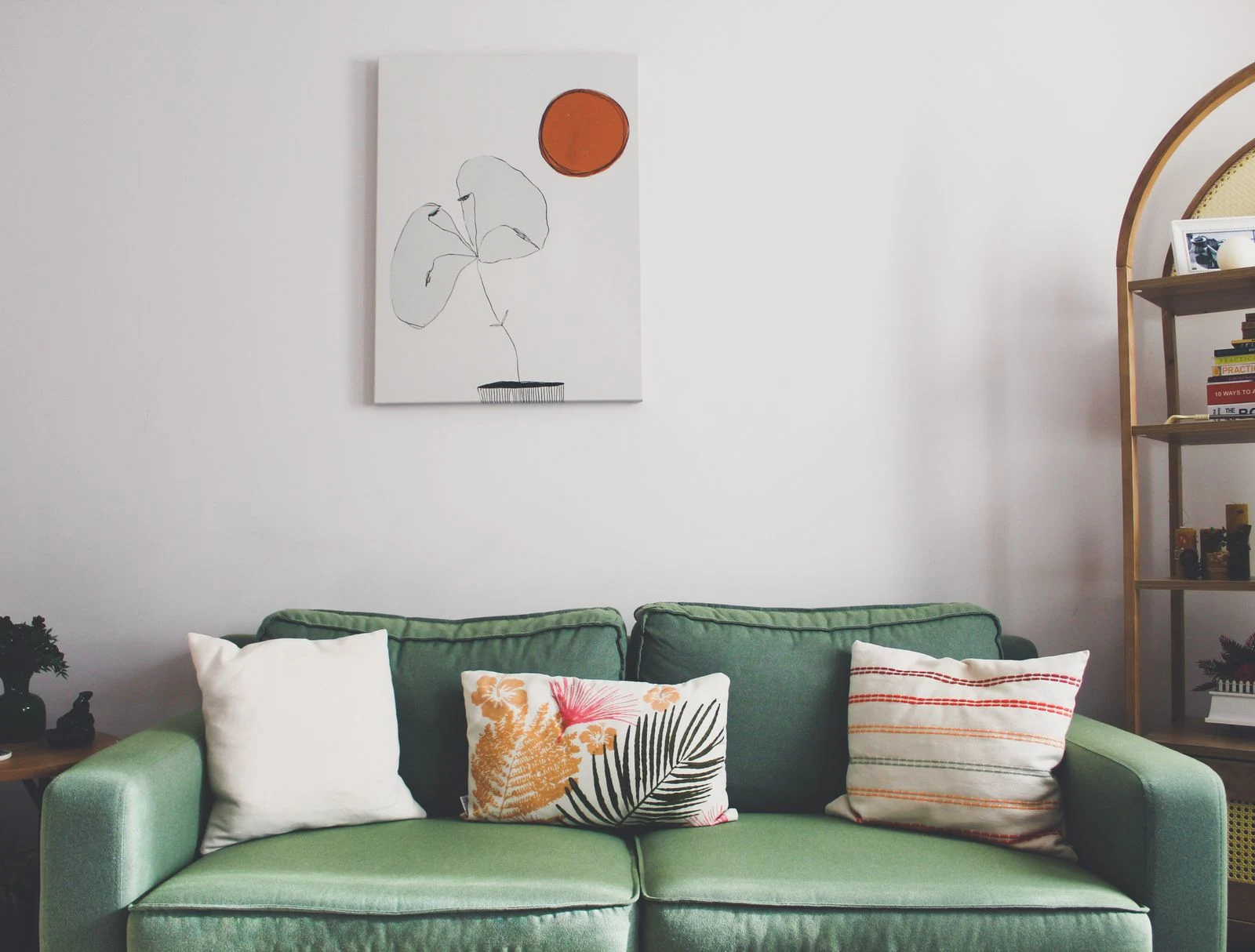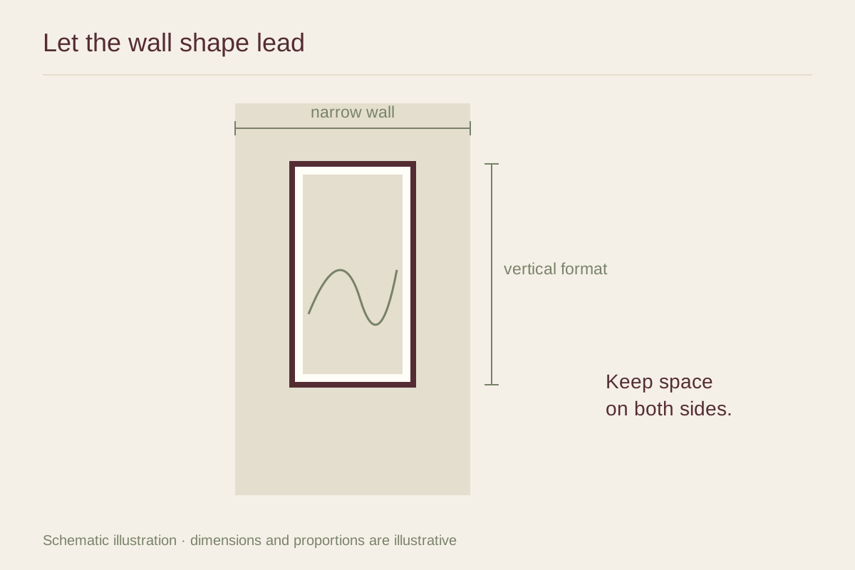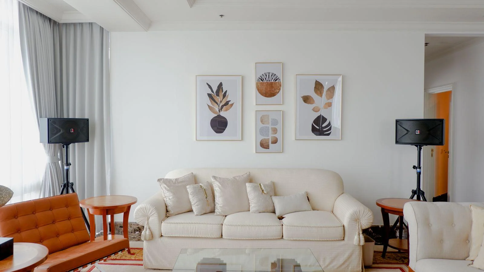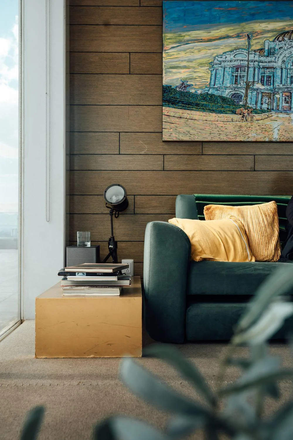
Look for a broad relationship
Do the woods share a warm cast, a pale value, or a visible grain? Those qualities matter more than assigning every piece to a named species. A print with warm brown lines may connect several finishes, while a black-and-white work can step outside the wood palette and keep the room from becoming overly tonal.
Avoid choosing art solely to reconcile furniture you already own. The image should still be something you want to see. Use the room as a filter for scale and intensity, then let subject and composition guide the final choice.
Give the frame one clear role
A wood frame can repeat one existing finish without matching all the others. For example, a dark frame may echo a small cabinet while a pale floor remains the dominant surface. The repetition is easier to read when the tones are clearly related rather than nearly identical.
A painted or metal frame can also remove the pressure to add another wood tone. Test black, soft white, or a muted color drawn from the artwork. The frame's width matters: a broad edge contributes more material and color than a narrow profile of the same finish.
Judge the room in layers
Place the proposed art near the furniture it will accompany and view it with the floor visible. A tight wall crop leaves out one of the largest wood surfaces in the room. Include nearby textiles too; a rug or curtain may already be doing much of the work of connecting the finishes.
If the combination feels restless, simplify one part of the display before replacing the artwork. A quieter mat, fewer objects on the sideboard, or more space between pictures can make the wood mix easier to appreciate. Coherence can come from editing the arrangement as much as from finding a matching color.
Avoid collecting samples without a decision
Limit the frame comparison to a few clear directions: repeat the darkest wood, repeat the lightest wood, or use a nonwood finish. Put the samples beside the artwork and the nearest furniture rather than judging them against every wood surface at once.
Once one direction works, refine its width and tone. This is more useful than accumulating a dozen subtly different brown samples, each of which seems almost right in a different corner. The frame belongs most closely to the picture, even while it participates in the room's material mix.