Choose one visible link
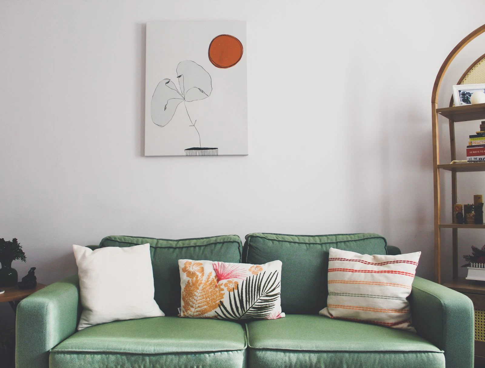
Lay the two images side by side and identify what they share. A curved branch might echo the line of a figure; a pale sky might connect with open paper in a drawing. One clear link is usually easier to read than several weak attempts to make every detail agree.
Compare their visual weight. A dense, dark photograph may dominate a pale sketch even when their outside dimensions match. You can accept that hierarchy, increase the lighter image's surrounding space, or choose a different size. Equal frames do not automatically create equal presence.
Decide how formal the pair should feel
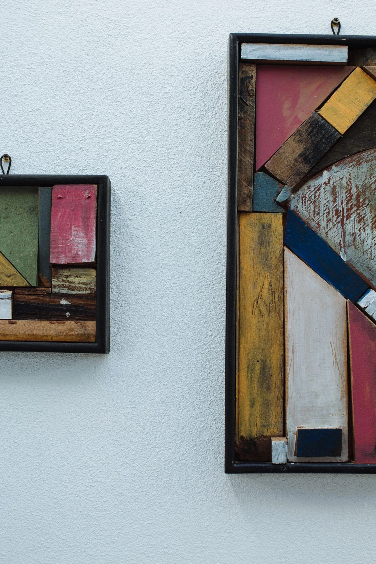
Matching frames and mats make a pair read as a deliberate unit. Different frames can preserve a sense that the works were chosen separately. If the subjects are already very different, repeating one frame quality, such as color or profile width, can provide enough structure.
Test the images in both left-to-right orders. A figure's gaze, a road, or a diagonal shape may lead toward the other picture or away from it. There is no rule that every direction must point inward, but the change can affect how the pair feels.
Place them as one arrangement
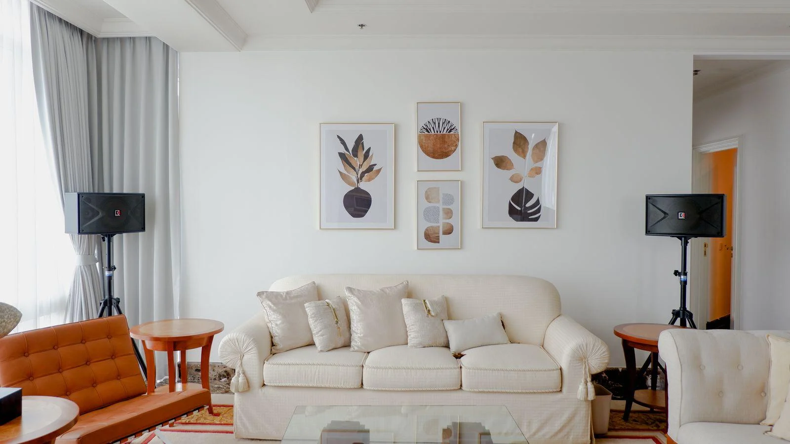
Use paper outlines to judge the combined width and the gap between frames. The empty space is part of the pair. A very wide gap can make the pictures seem unrelated, while a narrow gap can make frames with different profiles feel crowded.
Check the pair from the usual viewing position and with nearby furniture visible. If one image keeps overwhelming the other, try displaying them on adjacent walls instead. Their relationship can still be present across the room without requiring them to behave as identical partners in a tight pair.