Choose the contrast you want to see
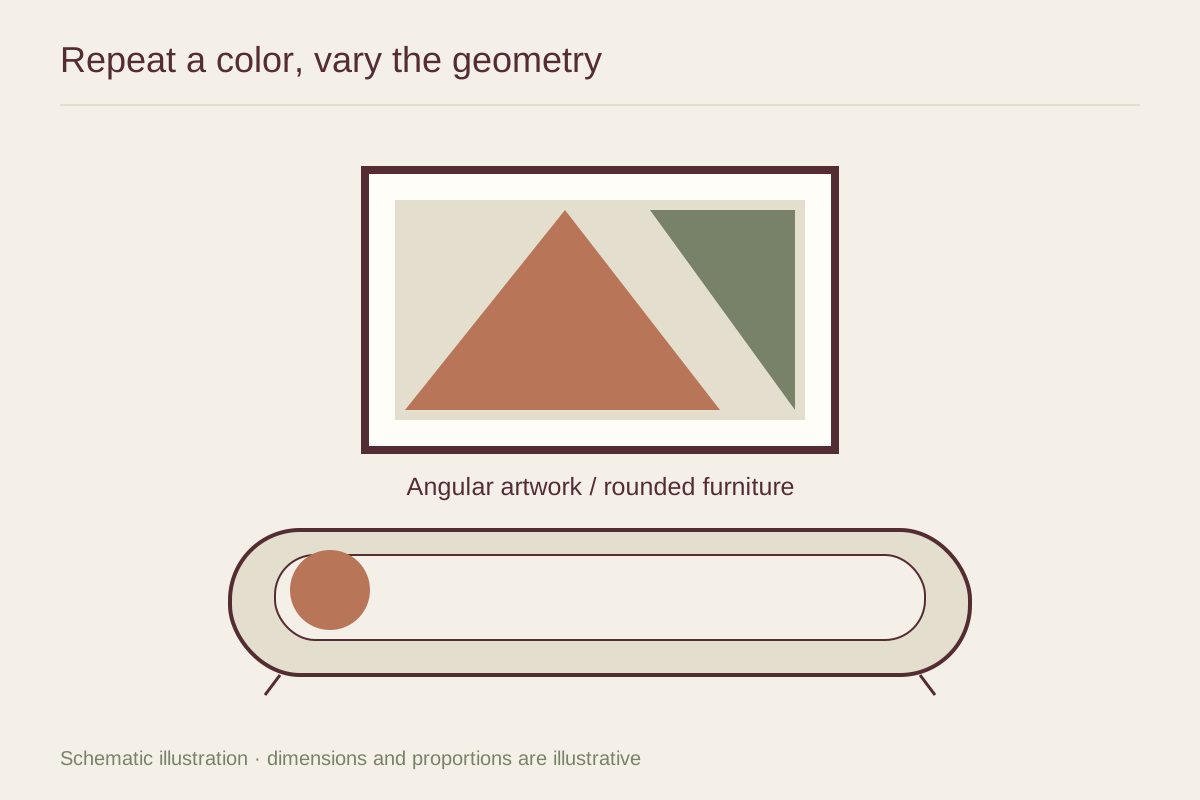
A print built from straight bands can give structure above a curved sofa. A composition of circles may echo the sofa more directly. Neither is automatically harmonious: the first relies on contrast, while the second relies on repetition. Put both possibilities into a simple wall mockup and notice which gives the furniture a clearer outline.
Scale matters within the artwork. One large circle reads differently from a grid of tiny circles. A room with a rounded coffee table and arched doorway already contains several strong curves, so a quiet angular image may provide a useful change. If the room has only one curved chair, a rounded form in the print can make that chair feel connected.
Use color to hold unlike shapes together. A restrained palette lets you combine a diagonal composition with rounded upholstery without adding another layer of contrast. For example, charcoal and cream geometry can sit above a soft tan sofa while a small rust accent connects to a nearby object.
Keep the presentation precise
Geometric images often make uneven borders and crooked hanging especially noticeable. Check that printed margins are intentional and the mat opening does not clip one side more than another. The outside frame can be simple, allowing the internal shapes to establish the main rhythm.
Consider the actual distance between the picture and the furniture. A very low frame can make a curved sofa back look compressed beneath it. A very high frame may lose the relationship altogether. Use a paper template and judge from a seated position as well as from the doorway.
Let the pairing remain the principal shape conversation in that area. A zigzag cushion, striped rug, sculptural lamp, and busy geometric print can compete even if their colors match. Remove one patterned element during the test. If the art and furniture become clearer, you have found a more useful balance without needing to change either main piece.