Choose one shared quality
Start with a common paper tone, a related green, or a similar amount of open space. That single connection gives you room to vary the plants and drawing styles. If every element changes at once, the collection may read as several unrelated purchases; if everything matches, it can feel more like a packaged suite.
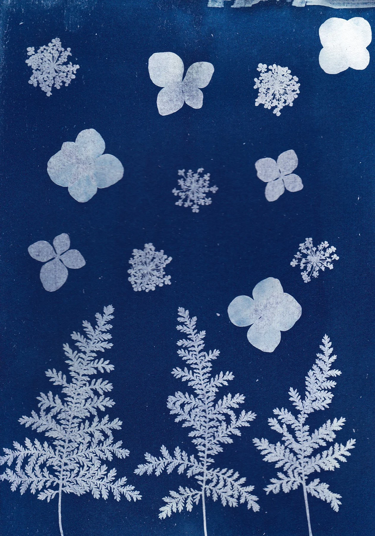
For example, pair a detailed fern on cream paper with a looser flowering stem that has a similarly quiet background. Add a third print with a broader leaf shape if the first two are fine and feathery. The difference in silhouette gives the group rhythm while the backgrounds keep it coherent.
Vary the scale of the plants
Three plants of equal height can create an even, specimen-like row. A larger leaf beside two smaller studies makes a more varied composition. Compare the scale of the depicted plant as well as the outside frame size: a small subject surrounded by paper may feel much lighter than a full-page leaf in the same frame.
Keep any captions legible if they are part of the appeal. A reproduction with botanical labels can lose its character when reduced until the lettering becomes a gray blur. Use a close-view location or choose an image that remains satisfying without reading the text.
Unify the framing without flattening the differences
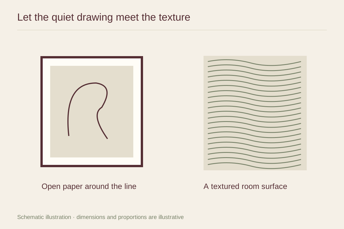
Related frames can provide enough structure for mixed images. They might share a wood tone while differing slightly in width, or use the same simple profile with mats adjusted to each sheet. Avoid forcing every print into the same opening if that hides its border or crowds its subject.
Lay the group out with paper templates before hanging. Look for an easy movement between the plant shapes, and leave enough space for each outline to remain distinct. Nearby living plants can echo the subject, but a dense collection of pots directly below the pictures may make the wall busy. Let either the prints or the real foliage carry most of the detail in that area.