Give the map a clear companion
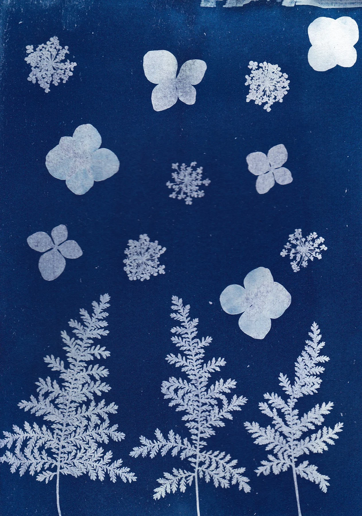
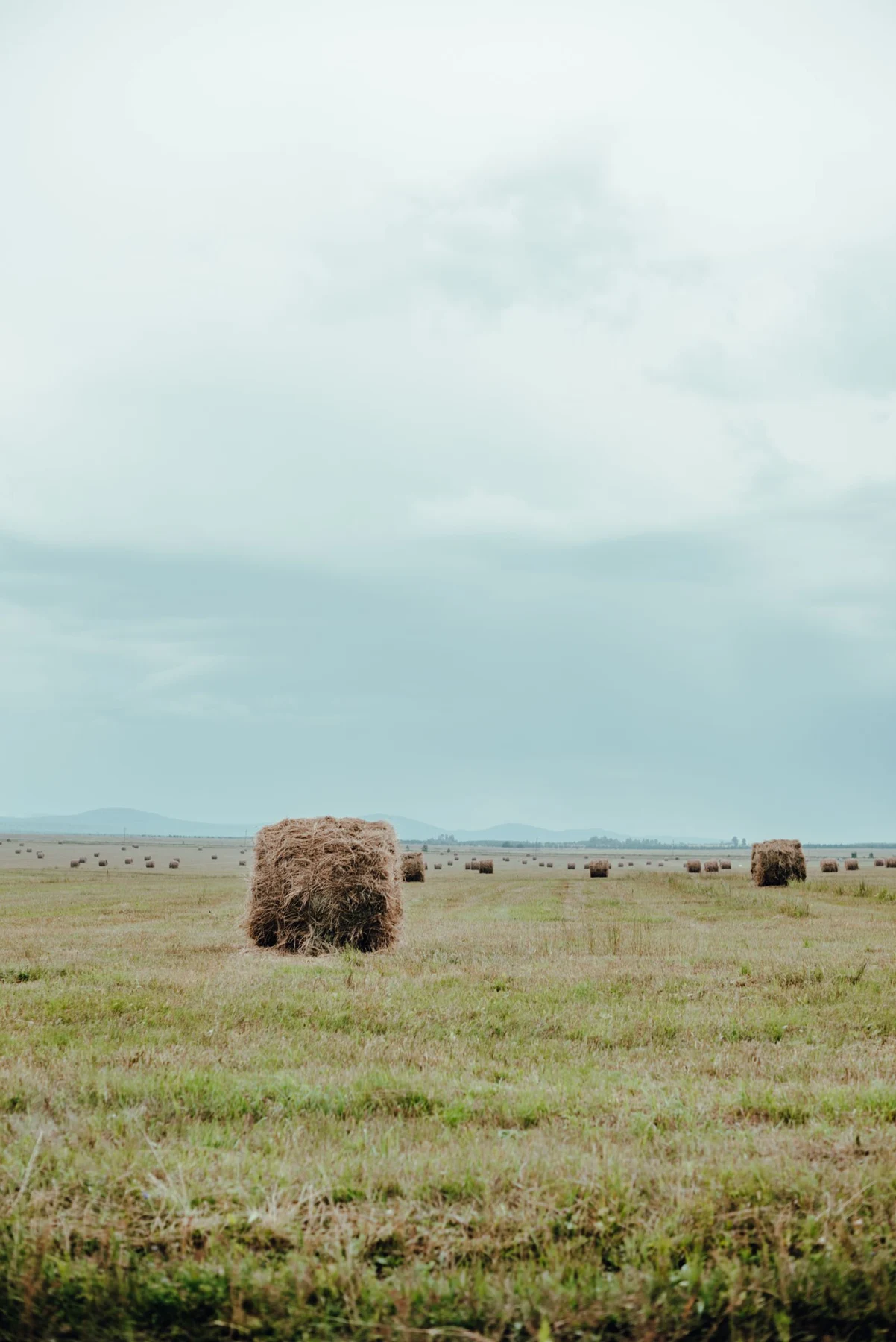
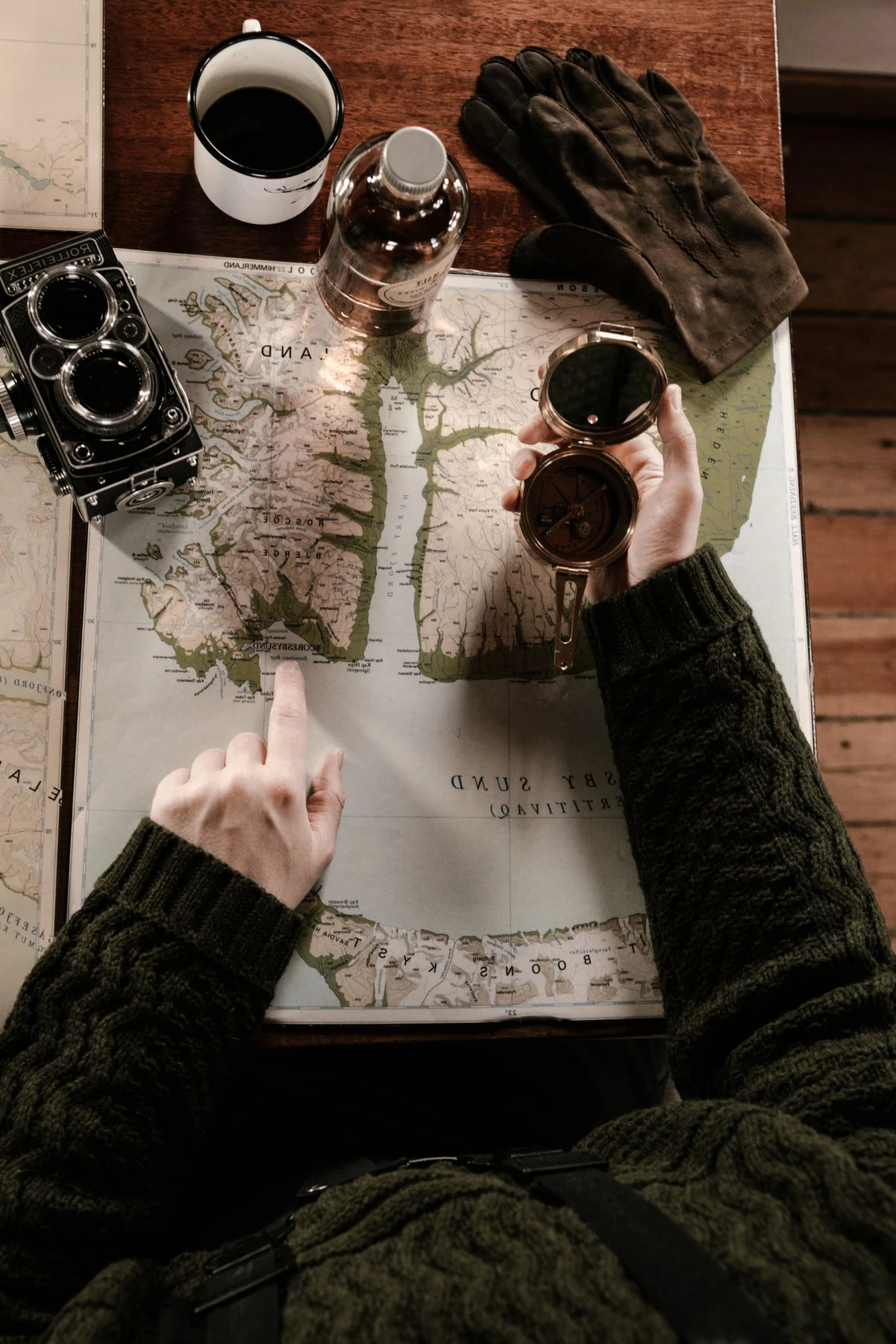
A quiet landscape photograph can sit well beside a detailed city map because each offers a different way of seeing a place. An abstract image with broad shapes can provide an even stronger contrast. Two highly detailed maps may work as a set, but they will ask for more sustained attention from the viewer.
Choose one connection: a shared blue, a related paper tone, or a place with personal meaning. If the connection is geographic, it need not be obvious to every visitor. The arrangement can hold a private association without adding a wall label to explain it.
Check the map's scale
A map chosen for its street names needs a location where you can stand close enough to read them. If it is hung above a deep sofa, the fine text may function only as texture. Decide whether that is acceptable before choosing the print size.
Keep the map's margins and legend in the framing conversation. A standard opening can hide a scale bar or crop a border unevenly. Review the full sheet rather than treating the central land area as the only important image. For an old or fragile map, have a professional assess the mounting needs.
Balance frames and spacing
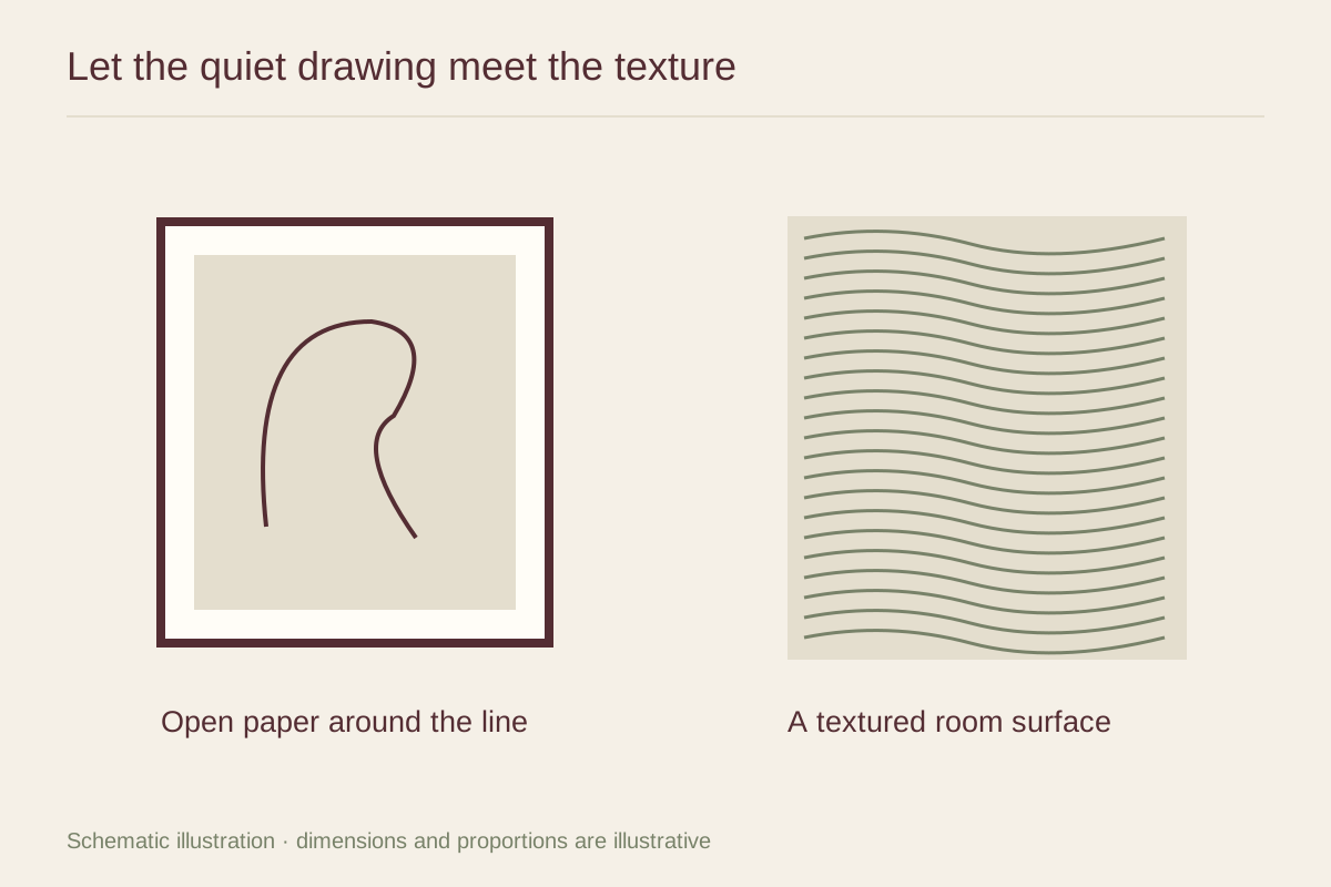
Matching frame finishes can connect a map and a photograph even when their dimensions differ. The mats can be adjusted to each object rather than forcing identical openings. Place the denser map where it does not crowd the quieter picture's main subject.
If printing a map from an online collection, check the item's own rights and access information and obtain the appropriate image file. The Library of Congress notes that online availability alone does not determine reuse rights. Keep those details with the file. Then choose the arrangement for how the two finished objects look together, not merely for the convenience of downloading them at the same size.