Read it from the intended seat
A phrase that looks large on a product page can be surprisingly small in a framed print. Check the letter height within the image, not just the sheet size. Wide margins and several lines of text can leave each word much smaller than the overall dimensions suggest.
Print a sample at approximate scale or create a paper mockup with lettering of similar size. View it from the chair, doorway, or desk where it will normally be seen. If the text is meant to be read, do not rely on visitors walking up to the wall to decode it. If it is mainly a graphic composition, choose one that remains satisfying as a pattern.
Check contrast and line breaks
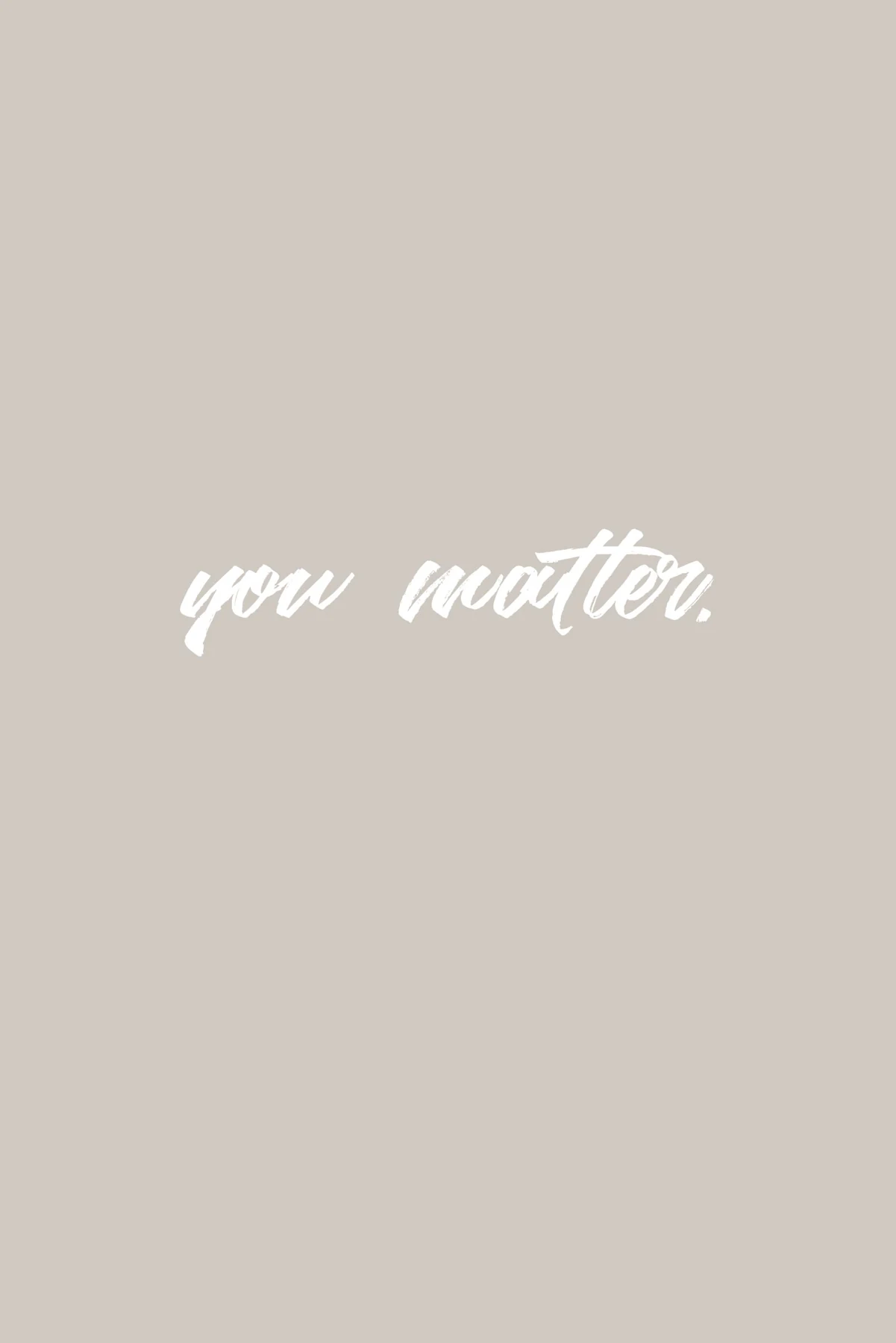
Thin pale letters on a pale background may disappear under ordinary room lighting. Heavy letters can remain clear at a smaller size, but crowded spacing can make a phrase harder to parse. Look for intentional breaks that preserve the sentence's meaning and rhythm.
Read every word before ordering, including punctuation and any small attribution. A misspelling becomes more conspicuous when enlarged and framed. For a quotation, verify the wording and source with an authoritative reference or choose a design that does not make an uncertain attribution. Do not assume that a popular image has been checked.
Consider the language as part of the room
A private joke may be ideal beside your desk and less suitable for a shared dining room. A long passage asks for more attention than a single word. Think about whether you want to encounter that language repeatedly, including when the room is quiet or used for work.
The type style also carries tone. A compressed uppercase face can feel emphatic; a delicate script can feel more intimate. These impressions are personal, so test the actual design rather than applying a rule that one font belongs in a particular room.
Frame without clipping the sentence
Keep enough margin around the text for the mat or frame overlap. Letters close to the paper edge are vulnerable to accidental cropping. Confirm whether the listed size includes a printed border and ask for the final visible opening if purchasing the print already framed.
A plain molding often lets the lettering establish the character. If the type is ornate, a busy frame can create a second competing pattern. Check reflections over dark backgrounds as well; a bright lamp reflected across a sentence can make it unreadable even when the letters are large. The final test is the assembled view under the light you actually use.