Look beyond the flower color
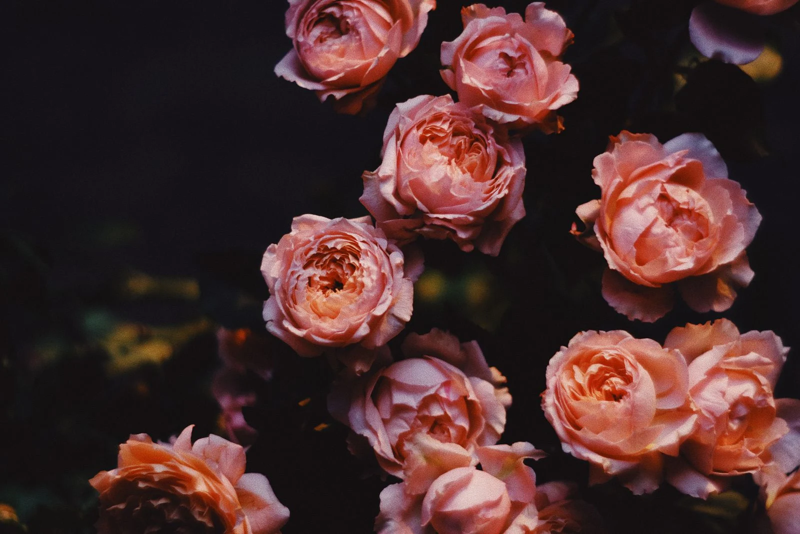
A burgundy or nearly black background can make pale petals stand forward. A deep green background may connect the flowers to foliage more softly. Compare the entire color field with the wall; the background may occupy more space than the blooms and therefore have the greater effect on the room.
Choose the level of detail
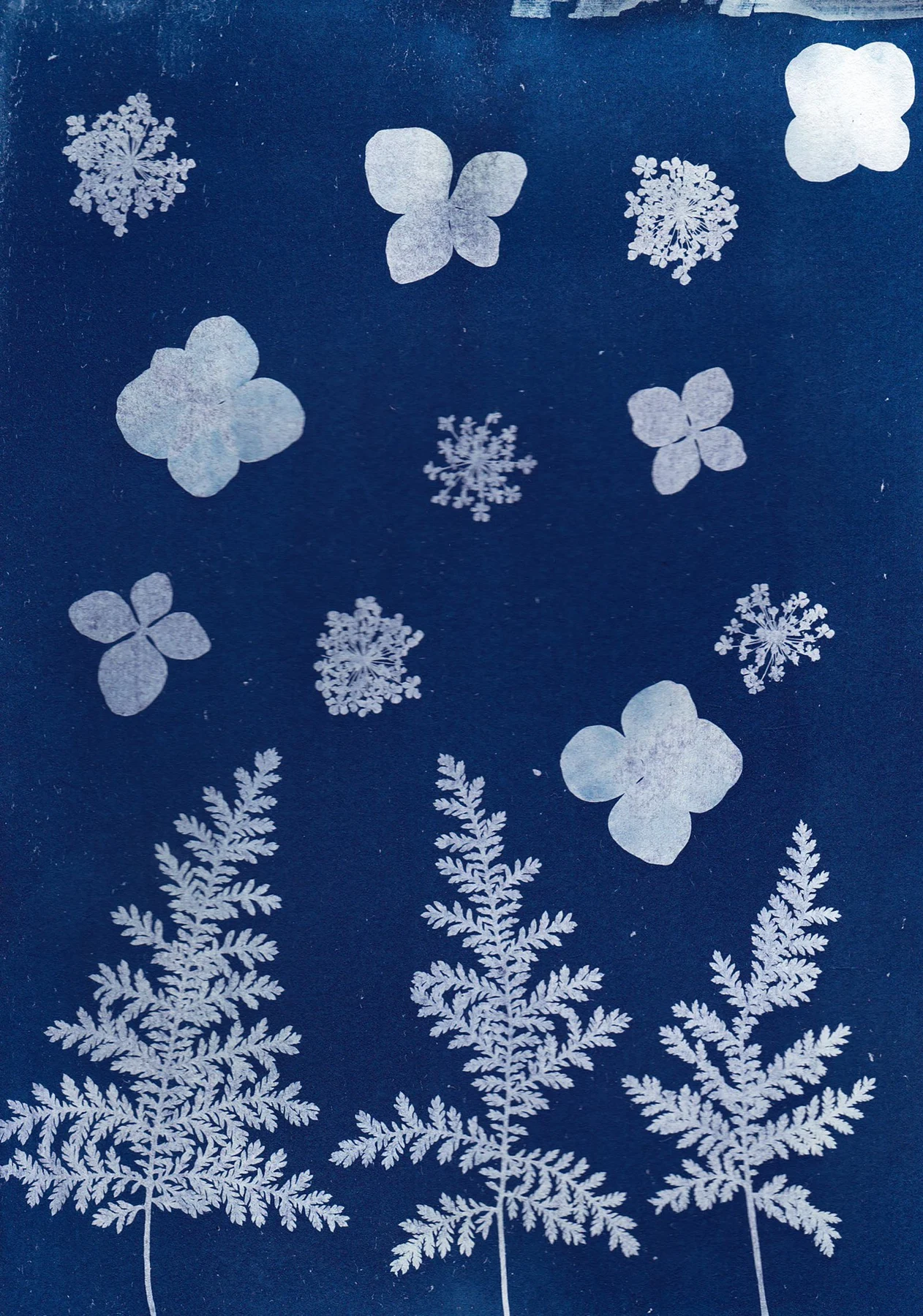
A dense bouquet with many small highlights feels different from a single branch. In a room with patterned upholstery, one clearly defined flower can be easier to read. On a plain wall above simple furniture, a more intricate arrangement can reward a longer look.
Check the dark areas in a physical print or a detailed sample. If all the foliage merges into one black patch, you may lose the layered effect that attracted you. A screen preview cannot fully show how the chosen paper and lighting will handle those shadows.
Test the border
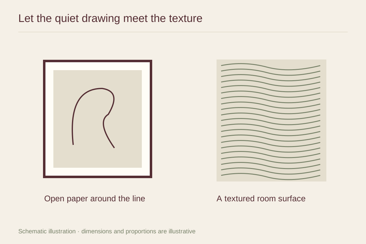
A dark frame can extend the background and make the picture feel continuous. A pale mat introduces a break that may help the print sit on a dark wall. A warm wood frame can connect with stems or earthy colors, but a strongly orange wood may compete with pink or red flowers.
Use a generous sample of any mat color. A cream strip that looks pleasant at one corner becomes a large field around all four sides. The mat should create the amount of separation you want, rather than being chosen automatically because the paper itself is pale.
Place it where the image remains visible
Reflections show readily over a dark background. Check the wall from the usual sitting position and compare evening lamps as well as daylight. A lower-reflection glazing sample may be useful, but a change of position can also solve the problem.
Keep nearby decorative flowers optional. The print already supplies a strong floral presence; a plain vase or a simple lamp can give it room. This allows the artwork to feel integrated without turning the entire corner into a repeated bouquet.