Read the photograph's contrast
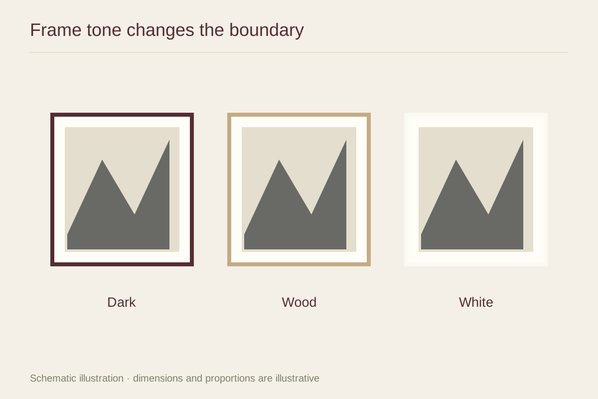
A high-contrast street photograph can hold its own inside a dark frame. A pale image of fog may look more delicate with a lighter boundary. Try both: the dark frame may give the fog a useful structure, while the light frame may let the image blend more quietly into the wall.
Compare the frame against the darkest and lightest parts of the picture. A black molding can echo a strong ink tone, but it can also create a new darkest element around a print whose blacks are intentionally soft. That difference becomes especially visible in a narrow mat.
Consider warm and cool grays
Not every black and white print is neutral. A warm-toned photograph can sit comfortably with a subdued brown wood, while a cooler image may relate to gray or a restrained metal finish. These are visual experiments, not requirements attached to the subject matter.
Use the intended mat in the comparison. A bright white mat between a warm photograph and a warm wood frame can become an unexpected cool stripe. A softer white may create a more continuous transition. Conversely, a deliberate contrast can give a very soft photograph clearer edges.
Let one material connect with the room
If the room already contains dark furniture, a black frame can repeat that weight without matching every wood finish. A natural wood frame can introduce warmth among metal and glass. You do not need to duplicate the coffee table precisely; a broadly related undertone is often enough.
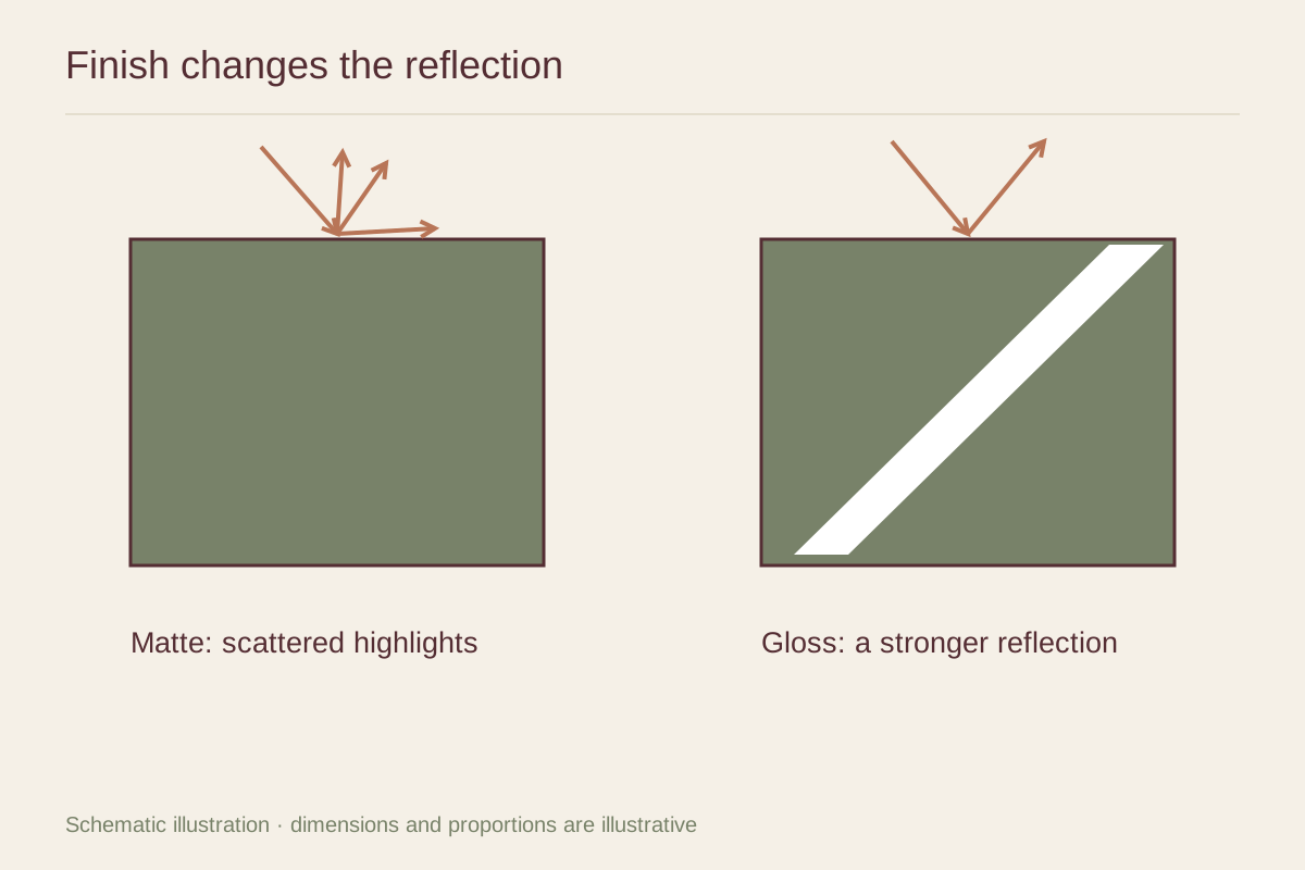
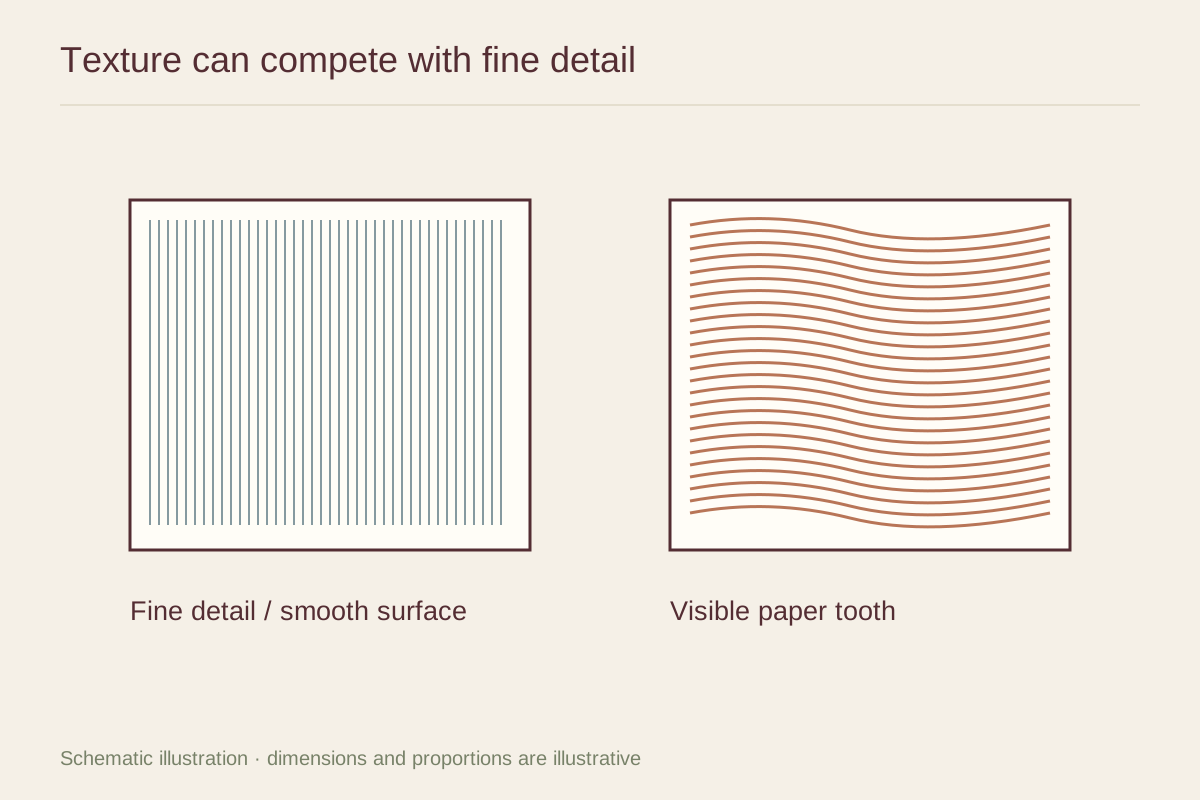
View the samples from the normal sitting position. Fine grain and subtle metallic texture may disappear at that distance, leaving mostly a dark, medium, or light border. Make the decision at that scale first. Then inspect the close-up finish, corner joints, and sheen so the frame also rewards the view from nearby.